Introduction
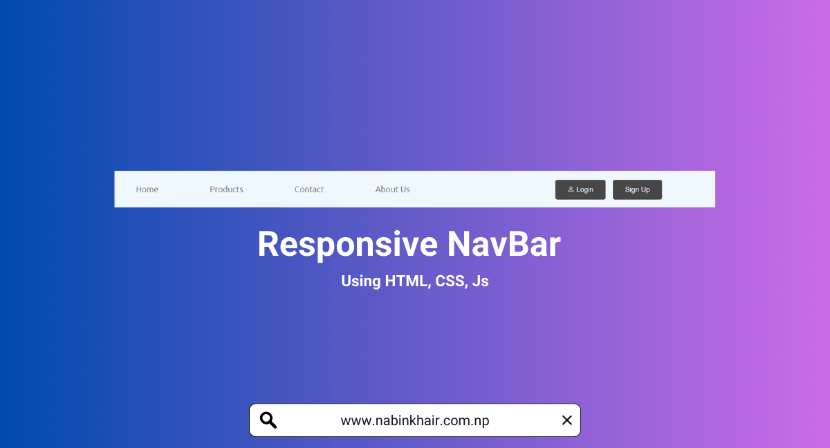
In the ever-evolving landscape of web development, creating responsive designs is crucial to ensure a seamless user experience across various devices. One fundamental aspect of a website is the navigation bar, which should adapt to different screen sizes. In this tutorial, we'll explore how to build a responsive navigation bar using HTML, CSS, and JavaScript.
HTML Code
  <!DOCTYPE html>
  <html lang="en">
  <head>
      <meta charset="UTF-8">
      <meta name="viewport" content="width=device-width, initial-scale=1.0">
      <title>Responsive Navigation Bar | Nabin Khair</title>
      <link rel="stylesheet" href="style.css">
      <link rel="stylesheet" href="https://cdn.jsdelivr.net/npm/bootstrap-icons@1.11.1/font/bootstrap-icons.css">
  </head>
  <body>
      <div class="navigation">
          <div class="hamburger-icon"><i class="bi bi-list"></i></div>
          <ul class="nav-list">
              <li><a href="index.html"> Home</a></li>
              <li><a href="Product.html"> Products</a></li>
              <li><a href="contact.html"> Contact</a></li>
              <li><a href="about.html">About Us</a></li>
          </ul>

          <div class="icons">
              <button class="btn"><i class="bi bi-person"></i> Login</button>
              <button class="btn">Sign Up</button>
          </div>
      </div>

      <script src="script.js"></script>
  </body>
  </html>
CSS Code
/*Nabin Khair*/
@import url('https://fonts.googleapis.com/css2?family=Ubuntu:wght@300&display=swap');
* {
    padding: 0%;
    margin: 0%;
    box-sizing: border-box;
}

body, html {
    height: 100%;
    width: 100%;
    font-family: 'Ubuntu', sans-serif;
}

.navigation {
    width: 100%;
    height: 12%;
    background-color: aliceblue;
    display: flex;
    justify-content: space-between;
    align-items: center;
}

.nav-list {
    display: flex;
    list-style: none;
    align-items: center;
    justify-content: space-evenly;
    width: 60%;
    margin-left: 10px;
}

.nav-list > li {
    padding: 0% 2%;
    cursor: pointer;
}

.nav-list > li > a {
    text-decoration: none;
    color: rgb(71, 71, 71);
}

.nav-list > li > a:hover {
    text-decoration: none;
    color: rgb(43, 42, 42);
}

.hamburger-icon {
    display: none;
    cursor: pointer;

}

.navigation>.icons{
    display: flex;
    width: 50%;
    height: 60%;
    align-items: center;
    justify-content: center;
}
.navigation > .icons >.btn {
    padding: 2% 4%;
    background-color: rgb(71, 71, 71);
    color: aliceblue;
    border: none;
    border-radius: 4px;
    outline: none;
    cursor: pointer;
    margin-left: 2.5%;
}

.navigation >  .icons >.btn:hover {
    background-color: rgb(49, 48, 48);
    color: aliceblue;
    box-shadow: 0px 0px 5px 1px rgb(71, 71, 71);
}

@media only screen and (max-width: 680px) {

    .nav-list {
        display: none;
        flex-direction: row;
        width: 100%;
        margin-right: 0%;
        background-color: aliceblue;
    }
    .nav-list.show {
        display: flex;
    }

    .nav-list > li {
        padding: 10px;
    }

    .hamburger-icon {
        display: block;
        padding: 0%;
        margin-left: 5%;
    }
    .navigation>.icons{
        display: none;
        width: 40%;
        height: 60%;
        align-items: center;
        justify-content: center;
    }
}
JavaScript Code
document.addEventListener("DOMContentLoaded", function () {
    const hamburgerIcon = document.querySelector(".hamburger-icon");
    const navList = document.querySelector(".nav-list");

    hamburgerIcon.addEventListener("click", function () {
        navList.classList.toggle("show");
    });
});
Conclusion
This responsive navigation bar uses a combination of HTML for structure, CSS for styling, and JavaScript for toggling the navigation menu on small screens. The media query in the CSS ensures that the navigation bar adapts to smaller screens by hiding the regular navigation list and displaying a hamburger icon that, when clicked, toggles the display of the navigation list.